
Signage plays an essential role in communicating with attendees and creating memorable experiences at any successful event. Graphics are pivotal in navigating the venue, identifying specific breakout rooms, and letting everyone know what’s on the menu. All signage isn’t created equal and some signs can pose challenges, being either difficult to read or confusing. With the concept of DEI (Diversity, equity, and inclusion) an increased priority for meeting and event planners, creating graphics prioritizing accessibility and inclusivity is key to enhancing the overall attendee experience at your event.
The good news is that simple changes and consideration to your designs can create effective graphics for all attendees. Signage should consider all the attendees’ abilities and focus on designing for clarity, accessibility using universal symbols, and complying with regulations. Signage should also avoid unnecessary complexity, clutter, poor visibility, inconsistent messaging, and cultural insensitivity. In this blog, we'll share some valuable tips and best practices to ensure your event signage caters to all your attendees, regardless of their individual requirements.
Just as individual needs vary from event to event, there is no universal solution for DEI, and chances are you'll be fine-tuning your approach each meeting. There are some great considerations and best practices when it comes to graphics and visual communication that we’ll explore below. We’ll cover everything from choosing the most accessible font to even what colors to use (and which to avoid). Our goal is that this blog can be used as a helpful primer when planning graphics for your next meeting! Here's what we'll cover:
Font Selection
Spacing
Color Usage
Imagery
Placement & Sizing
Wayfinding
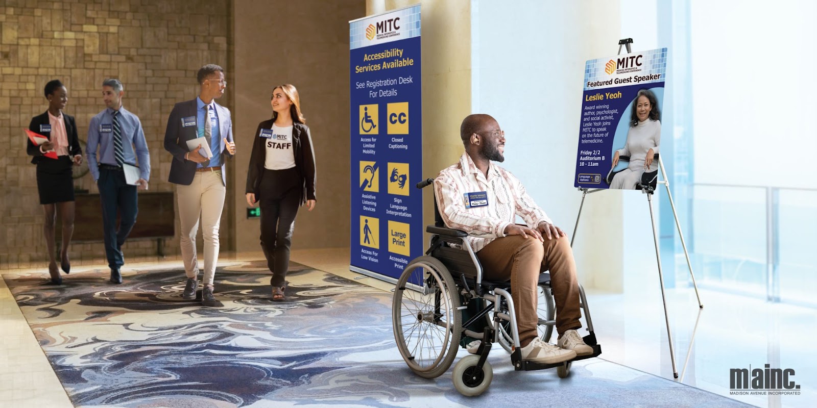
Accessible & Inclusive Signage Uses
Font Selection
One of the biggest benefits of on-site signage is that it’s an easy way to communicate to all your guests, so it’s important that your signs can be easily read! Thoughtful font selection can ensure that information is accessible to all guests, regardless of visual needs. While there is disagreement on the overall accessibility of serif vs. sans-serif fonts, studies from the Journal of Visual Impairment and Blindness found that sans-serif fonts are more readable for people with low vision. That doesn't mean that serif fonts should be avoided at all costs, but the designer must choose ones with the proper thickness, width, height, and other factors discussed above. 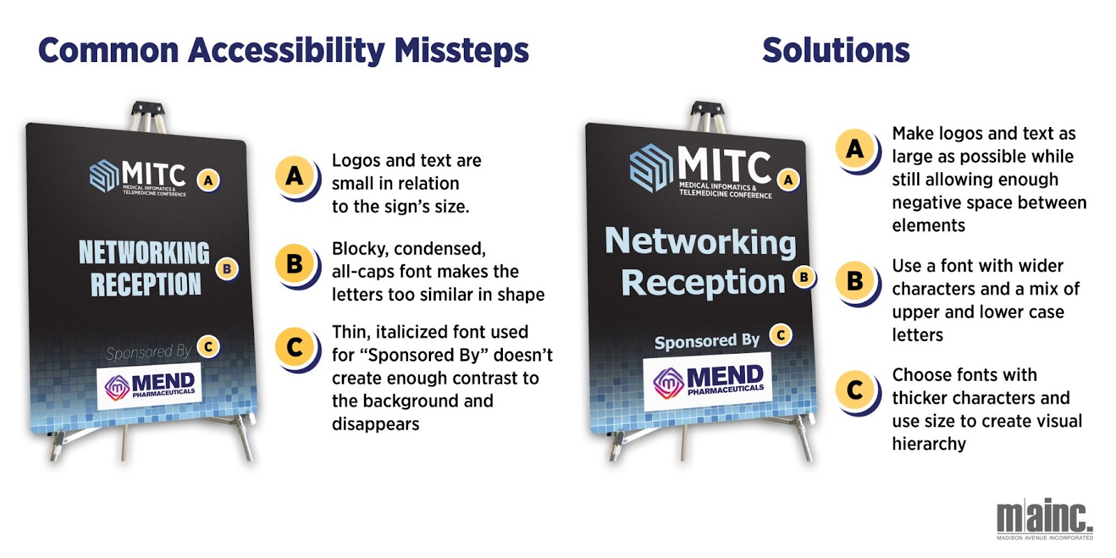
When it comes to selecting a smart font, consider a few options:
- Characters should have good thickness, width, and height and avoid being too similar in shape.
- It's advisable to avoid overly intricate or cursive font options and limit ALL CAPS and italics for optimal readability.
- Choose large-scale signage, taking both size and shape into account for effective communication.
Spacing
Visual clutter can be disorienting for anyone, but even more so for those with learning disorders or visual impairments. Providing enough breathing room between text, images, borders, and other design elements will make your signage more accessible. The Americans with Disabilities Act (ADA) guidelines for permanent signage (restroom signs, room numbers, etc.) recommend spacing between characters be within the range of 10% to 35% of the character height. They also suggest line spacing be between 35% and 70% of character height. While temporary signage is not legally obligated to follow these guidelines, they are a great way to ensure your signage is not just visually appealing but also easily read and accessible to all.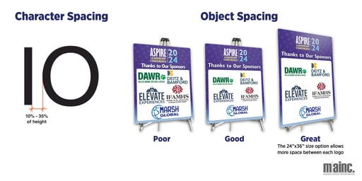
Color Usage
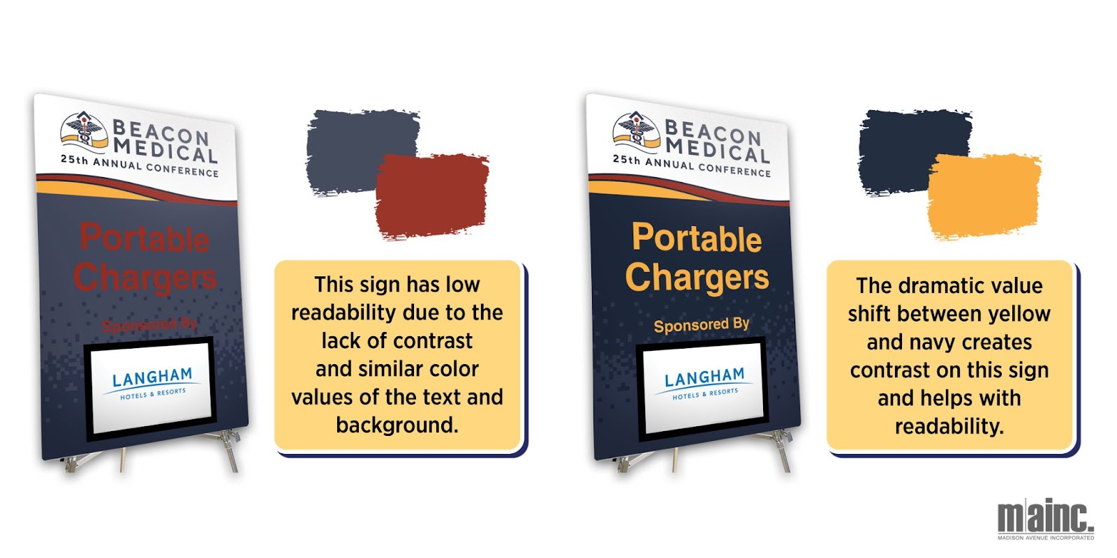
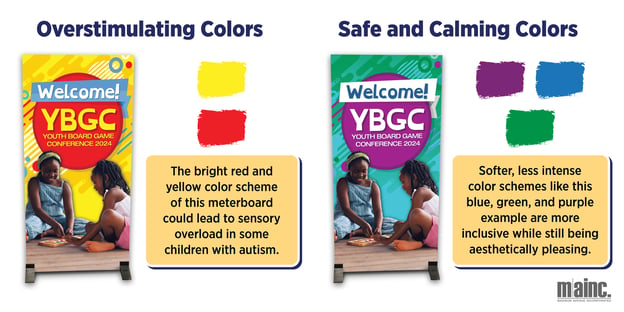
Color is another important factor in the accessibility of event signage. When it comes to text, opting for hues from opposite sides of the color wheel from the background enhances readability. Consideration should also be given to the value, which refers to the lightness or darkness of a color. When text and background colors have similar values, it can result in the content blending together. Maintaining a contrast between light and dark elements ensures clear separation in the design and makes your signage much more legible.
It’s not just visibility that color impacts, either. For children with Autism, bold and bright colors may be overstimulating. Studies have shown that reds and yellows, in particular, can induce tension and hyperactivity. When anticipating younger guests, opting for pastel shades, neutral colors, and muted tones can create a more pleasant experience for everyone involved.
Imagery
When deciding on information display methods, catering to guests' diverse learning styles is important for a truly inclusive sign. Adding symbols, infographics, or charts alongside text offers alternative means for individuals with learning disabilities to comprehend content and stay engaged in your event’s activities.
Embracing diversity and inclusivity also extends to the selection of photography or illustrated elements for your signage. Visuals should represent your attendees and capture a wide spectrum of races, genders, ethnicities, abilities, ages, and body types. Inclusivity in representation in your event signage fosters a more personal connection with attendees and showcases your organization's social awareness.
Placement & Sizing
To optimize accessibility for all attendees, it’s important to choose thoughtful positioning for signage. Consider the needs of wheelchair users by adhering to a general guideline that recommends placing the bottom of the sign at a height facilitating easy viewing and interaction. Select well-lit locations for signage, steer clear of areas prone to glare, and opt for matte finishes instead of gloss to minimize light-based visual obstructions. Size-wise, you can enhance readability for individuals with visual impairments by choosing a font size and character spacing (the space between letters and punctuation) that flow well with your design.
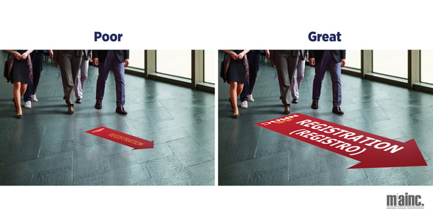
Wayfinding
Wayfinding signage plays a huge role in ensuring your event attendees, participants, and speakers are able to attend the sessions they’re interested in and find necessities like food, beverages, and restrooms. In addition to the best practices for event graphic design outlined above (font selection, spacing, color uses, imagery, and placement), here are some considerations for planning your directional and wayfinding graphics:
- Use multilingual signage. Consider the diverse linguistic backgrounds of your attendees. Provide signage in multiple languages commonly spoken by the event audience. Additionally, you can use simple language to enhance understanding for individuals with varying levels of literacy and universally recognized symbols and icons to convey information without relying solely on text.
- Be mindful of cultural differences when designing wayfinding signage. Avoid using symbols or images that may be offensive or misinterpreted by certain groups.
- Consider providing a map or key with gender-neutral restrooms clearly marked.
- Ensure signage provides clear and concise information about the event, venue layout, and important locations. Use
- Don’t be afraid to supplement your signage, either. Train event staff to assist with wayfinding, especially for individuals requiring additional support.
- Consider implementing interactive or digital wayfinding options that cater to different learning styles and preferences.
- Develop event maps that highlight accessible routes and include information on accessibility options like elevators, ramps, and other facilities. Mark the locations of amenities like nursing rooms, prayer spaces, and quiet zones.
Accessible & Inclusive Signage Uses
So now you’ve got some best practices and are ready to incorporate them into your planning, but where’s the best place to get started? Below are some suggestions for how you can use your signage to promote accessibility and inclusivity at your next event!
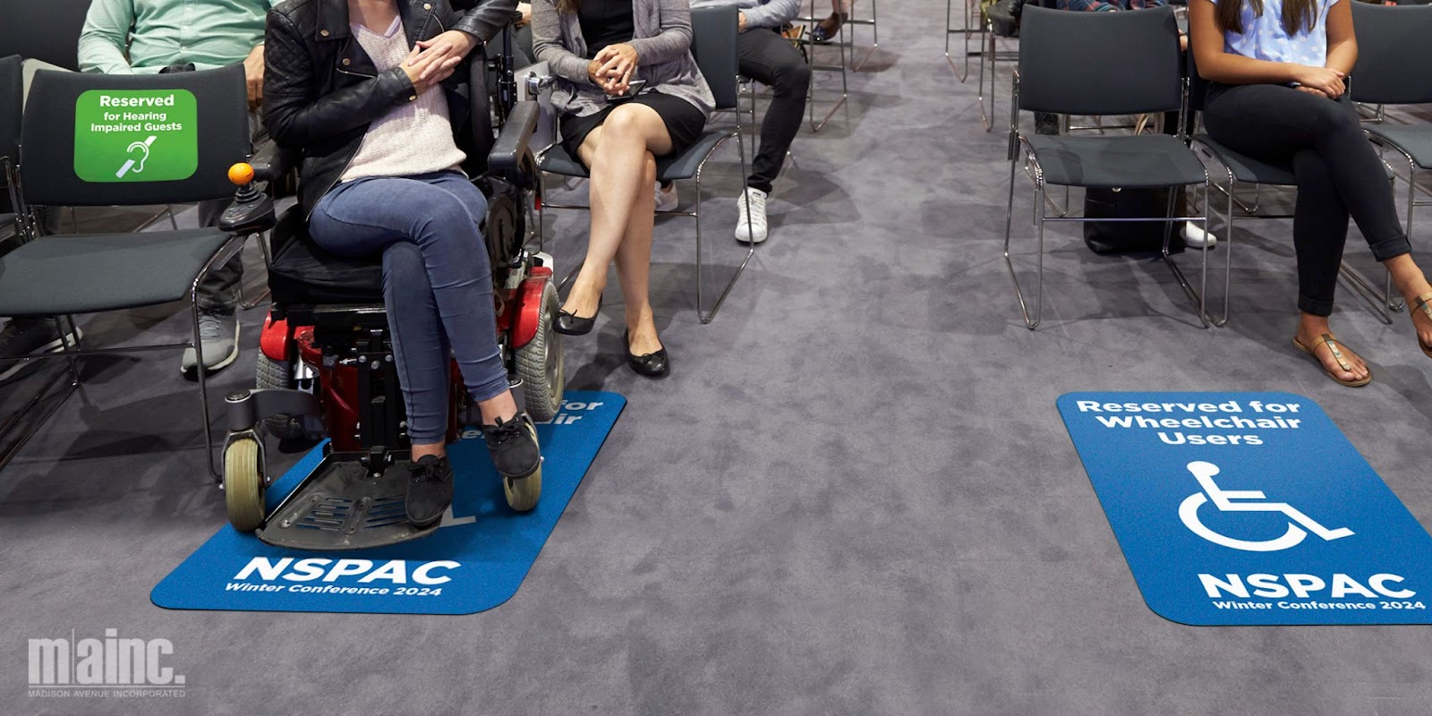
- Consider using wall decals to reserve the front row of seats for guests with hearing or visual impairments. This will allow them to get a clear view of interpreters or speakers and better engage with the event content.
- Floor decals are a great way to create designated areas for wheelchair users in auditoriums or other difficult-to-navigate spaces in venues. A space that is a minimum of 30 inches wide by 48 inches long is necessary to park a wheelchair in a stationary position. Keep that in mind when selecting your floor decal size.
- QR code signs paired with online content can be beneficial to guests with vision impairments, literacy difficulties, and language barriers. Multilingual versions of event content could be made available as downloadable audio or in a pdf. format. If you anticipate a large number of guests to speak the same non-english language, it might also be worth incorporating both languages on your signage.
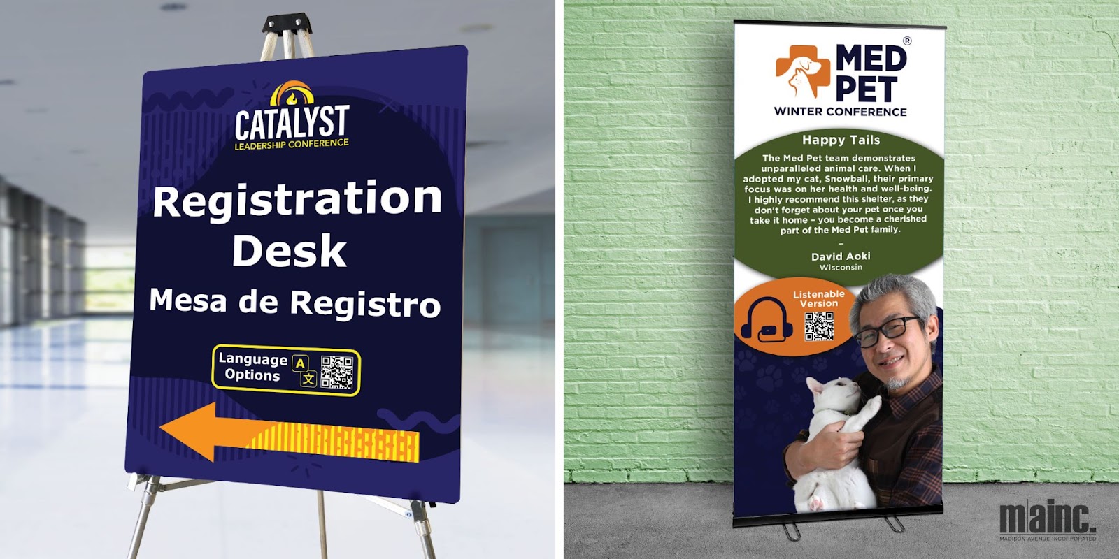
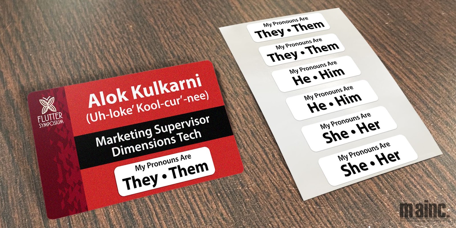
- Name badges can be used to promote a more inclusive atmosphere and respectful interactions among attendees. In addition to quick identification and networking, they provide the opportunity to display attendees’ preferred pronouns and phonetic name spellings. This information could be acquired during online registration and already printed on the badges, or added onsite through pronoun decals. Just be sure to design the badge layouts with enough room to accommodate.
- Incorporate braille into your event’s wayfinding signage to make navigation easier for visually impaired guests. The ADA recommends braille be positioned below the corresponding text and separated a 3/8 inch (9.5 mm) minimum from any other tactile characters and 3/8 inch (9.5 mm) minimum from raised borders and decorative elements. Our sign display stand paired with a custom braille graphic is a great option for marking the start of lines.
-
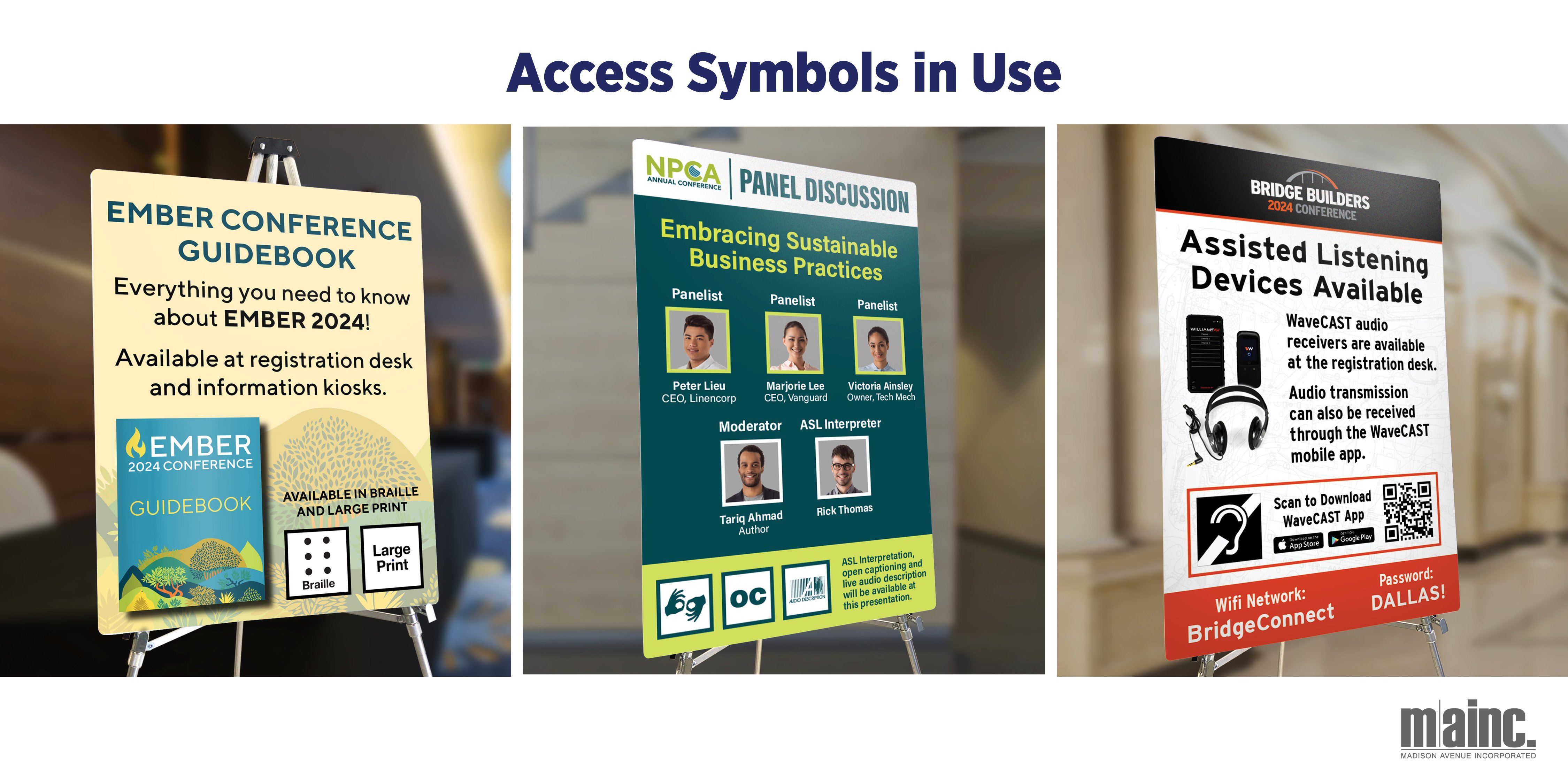
Symbols on signage are a universal way to communicate accessibility accommodations to all your attendees. Below are the widely recognized DEI symbols and their meanings you can incorporate into your event graphics.
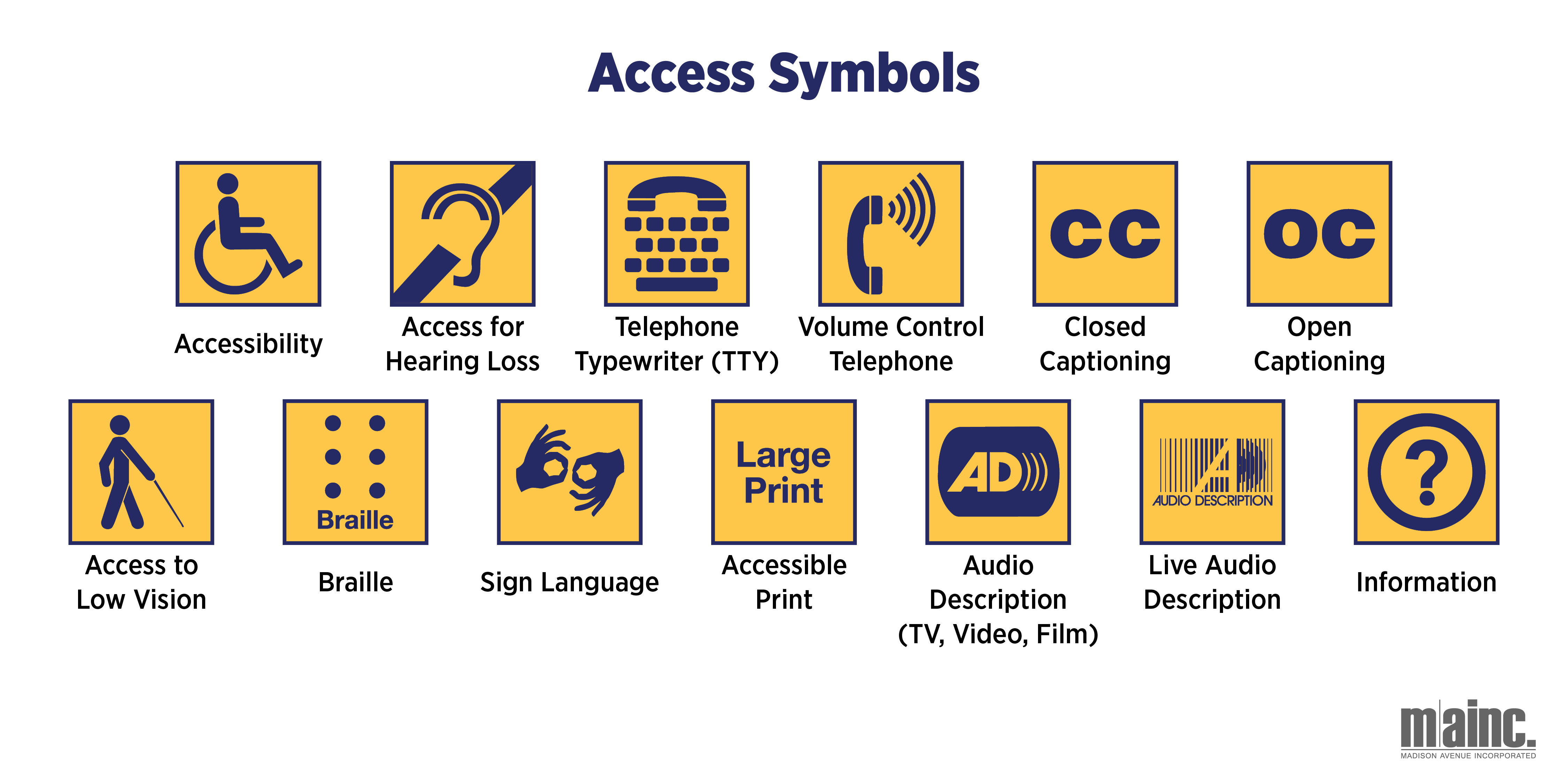
Low Vision Access: This symbol indicates areas tailored for individuals who are blind or have low vision. Examples on-site include guided tours through the venue or host city, access to nature trails or scent gardens in outdoor events, and interactive activities that include tactile experiences.
Audio Description Services: This symbol represents audio description services, benefiting those who are blind or have low vision. Trained describers provide verbal narration of visual elements during live TV broadcasts, videos, and films, enhancing accessibility for all attendees.
Live Audio Description: Similarly, this signifies live audio description services for individuals who are blind or have low vision. Trained describers offer real-time narration of visual elements during live performances or visual arts exhibitions.
Wheelchair Accessibility: This symbol signifies facilities accommodating individuals with limited mobility. Examples at an event include accessible entrances to event venues, wheelchair-friendly bathrooms, ramps, and accessible amenities like lowered phones for ease of use.
Telecommunication Devices: This symbol denotes accommodations facilitating communication for deaf, hard of hearing, and speech-impaired individuals. These devices enable real-time text-based conversations during live events.
Volume-Adjusted Telephones: This symbol identifies telephones with amplified sound and adjustable volume controls. Such phones cater to individuals with varying degrees of hearing loss attending your event.
Sign Language Interpretation: This symbol indicates the provision of sign language interpretation during speaker lectures, performances, and other breakout sessions, ensuring accessibility for attendees who are deaf or hard of hearing.
Access for Hearing Loss: This symbol represents access to systems such as infrared, loop, and FM, which transmit sound to hearing aids or headsets for individuals with hearing loss.
Large Print Materials: This symbol indicates the availability of printed materials in large font sizes, ensuring accessibility for individuals with visual impairments attending live events.
Information Accessibility: This symbol directs attendees to information desks where access accommodations, such as large print materials or sign-interpreted tours, are provided.
Closed Captioning: This signifies closed captioning for deaf or hard-of-hearing individuals attending live TV programs, videos, or exhibitions, ensuring accessibility to dialogue and other sounds.
Braille Materials: This indicates the availability of printed materials in Braille, including event agendas, documents, and signage at live events.
Let's Get Started!
The impact of event signage goes beyond mere navigating or an event agenda—it shapes the overall experience for attendees and reflects your brand’s commitment to inclusivity. Recognizing the diverse needs of your audience and taking steps to ensure your signage is accessible is not just a matter of practicality; it's a statement of your organization's values. So let’s take what we’ve learned together in this blog and embark on the path toward a more accessible and inclusive events industry!