
In an increasingly competitive meeting and event landscape, attendee experience is more important than ever. Not only is there competition for venue space and staffing but competition when it comes to getting prospective attendees to choose your event over others. With decreased budgets and priorities having shifted over the past few years companies are being more selective on where to spend budget dollars, and in turn, attendees are having to be more particular about which events to attend.
Paramount to attendee experience is the attendees actually knowing where they need to go, which is why signs, banners, and other visual communication have been a necessary part of our planning process and budget expense for decades. Would you believe us if we told you that you could take your signs and graphics from a necessary communication and wayfinding tool to a line item that contributes to an attendees' amazing experience at your event?
I’m sure we can all think of someone’s house we absolutely loved, or even couldn’t stand to be in. These feelings emerge based on the decor, clutter, cleanliness, and even if a room feels balanced to us. Walking into a venue or your event for the first time is no different for your attendees. Wowing your attendees from the moment they walk in through signage and decor is accomplished by fully embracing your event’s theme, venue layout, consistent branding, and clear messaging. Below we’ll dive into the best ways to avoid visual clutter and embrace your environment to invoke those positive feelings and create an even more memorable experience for your attendees.
Avoid Visual Clutter
The main goal of event signage is to make the experience easier for the attendee. With that in mind, it makes sense that taking a more minimalistic approach to designing on-site graphics continues to prove effective. You can leave your attendees with the wrong impression when your signage has too much going on visually, has text that is difficult to read, or clashes with your branding. The presence of unnecessary, disorienting visual elements on a sign is referred to as visual clutter. Here are some tips to help you avoid visual clutter and create simpler, more effective signage for your event.
Establish the Rules And Stick to Them!
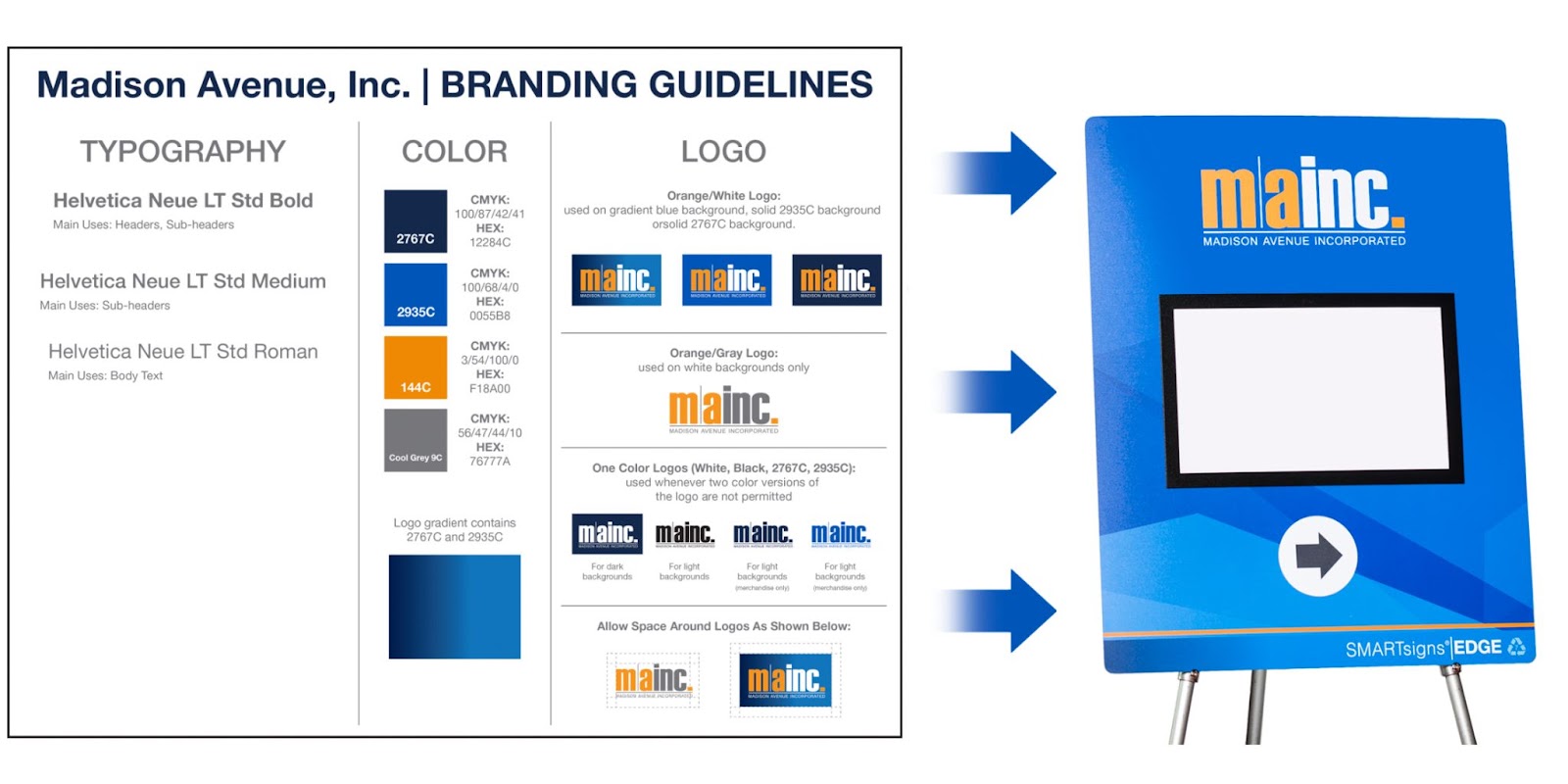
If you don’t already have branding guidelines or a style guide in place, it's worth taking the time to create one to establish a cohesive look for your event. Start by limiting the number of fonts and colors to be used and include any rules as to how your logo can be used or altered. These parameters will not only help your designer keep your branding consistent, but will also help them determine the most effective way to display information on your signage.
Consider Sign Placement
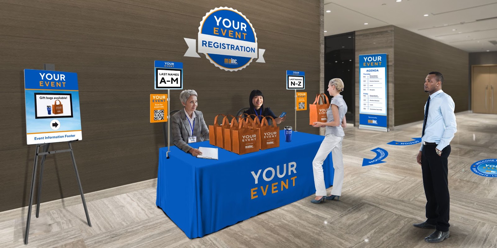
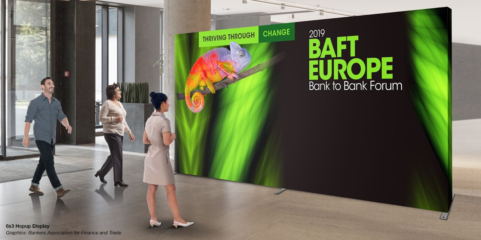
Be sure to consider how different signs in your order will look when placed together in the same room as “Visual Clutter” can occur when too many signs with walls of text and complex/colorful designs are in close proximity to one another. This can leave your attendees feeling overwhelmed, unbalanced and unable to process all of the information. Consider adding signage with more minimalist designs and negative space to help break up the space. A banner that’s mostly paragraphs of text and photos will seem more essential to read when it's paired next to a sign that’s predominantly one color with minimal information. Tables covered in minimalistic, branded tablecloths are a great (and functional) way to break up space in a conference room. Plus you now have a surface for tabletop signage or to display giveaway items!
Consider Scale, Space, and Messaging
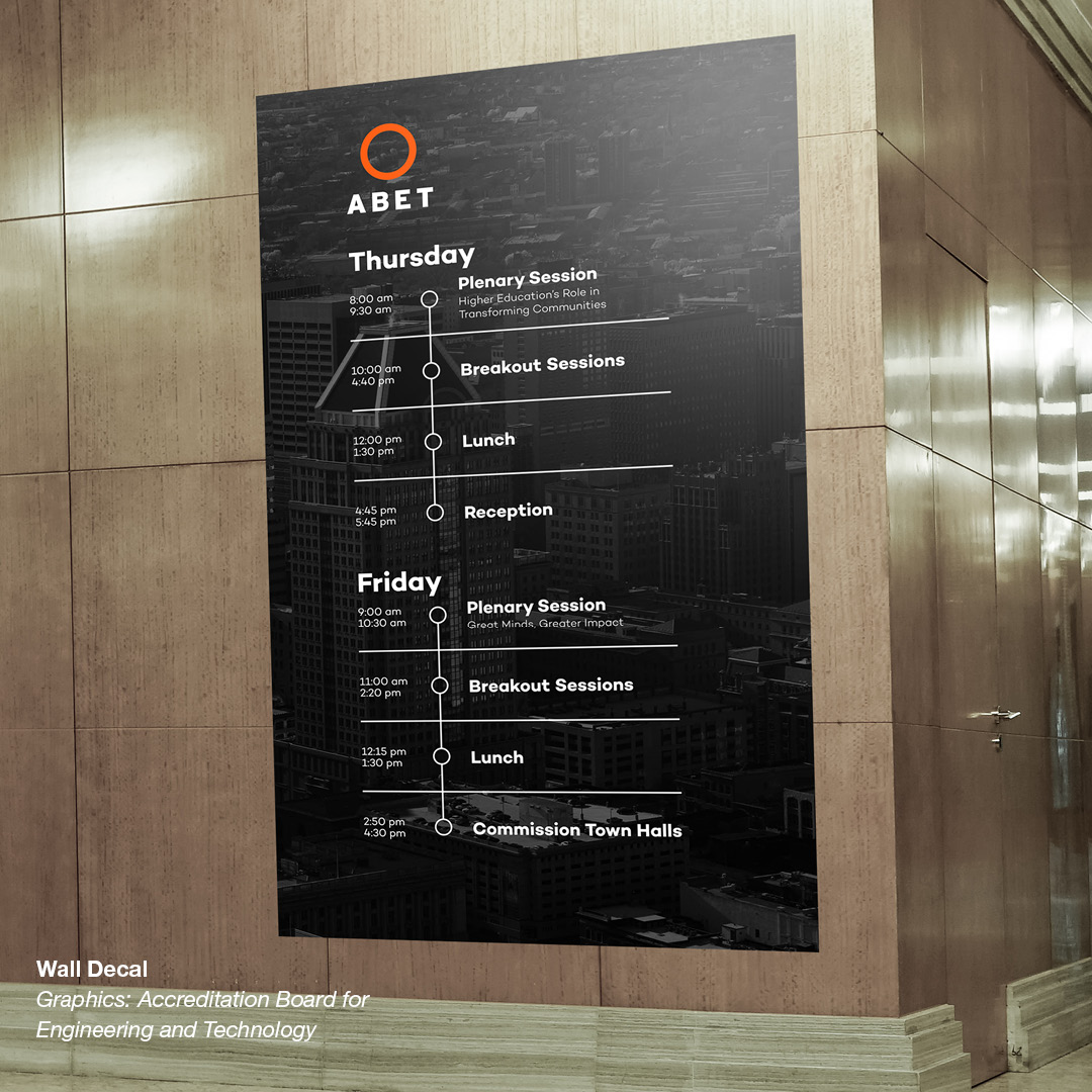
Choosing a sign type that is an appropriate size for the information displayed and its environment is another way to avoid visual clutter. Free-standing banners, retractable banners, meter boards, and wall decals are great options for event schedules and maps as they provide ample space to list the names, locations, and times of activities. Their large scale also allows multiple attendees to receive information at the same time when walking by and prevents attendees from having to gather around the banner.
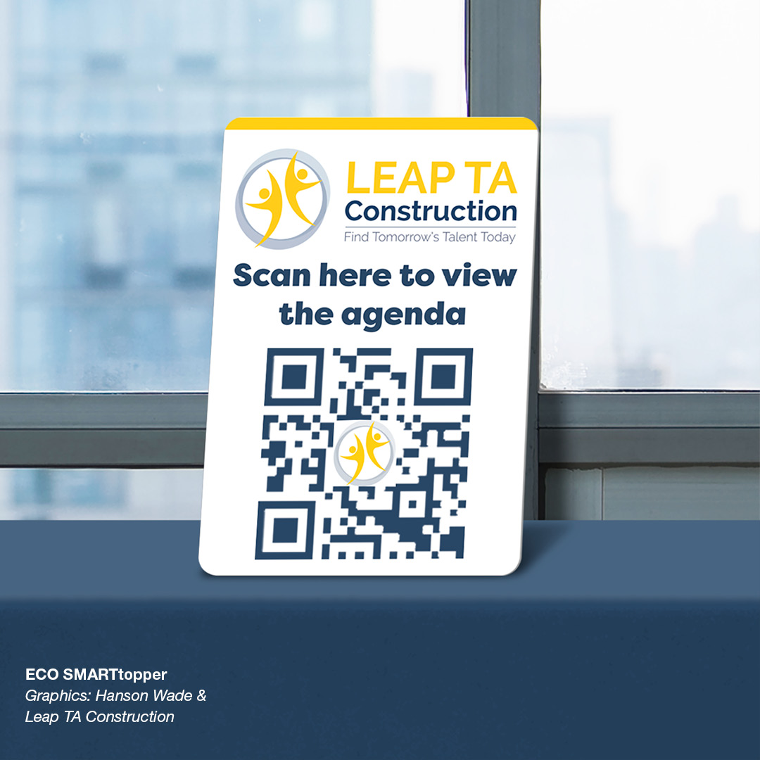
If you have limited space, an easel or tabletop sign with a QR code is a great option. The QR code enables attendees to view the event schedule or map on their personal devices and ensures they still receive the information they need even when space is limited.
Welcome signage makes a greater impact when it utilizes large-scale signage options like wall banners, pop-up displays, or decals. As is implied by the name it is usually the first impression of your event your attendees get, so you want it to set the tone and make a big impact.
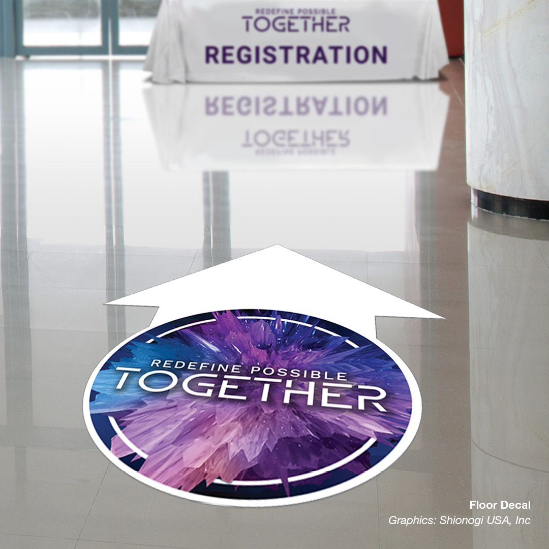
What scale to choose for directional signage depends mostly on the content and event space. If your venue has a huge front lobby or registration area, it would be more appropriate to use banners or large arrow-shaped floor decals that can be seen from a distance. Mid-sized directional signage might be more effective in compact spaces.
Embrace The Environment
Adding environmental signage, or signage that’s specifically designed to utilize the architecture of your event space or venue is a great way to create that memorable wow factor at your event.
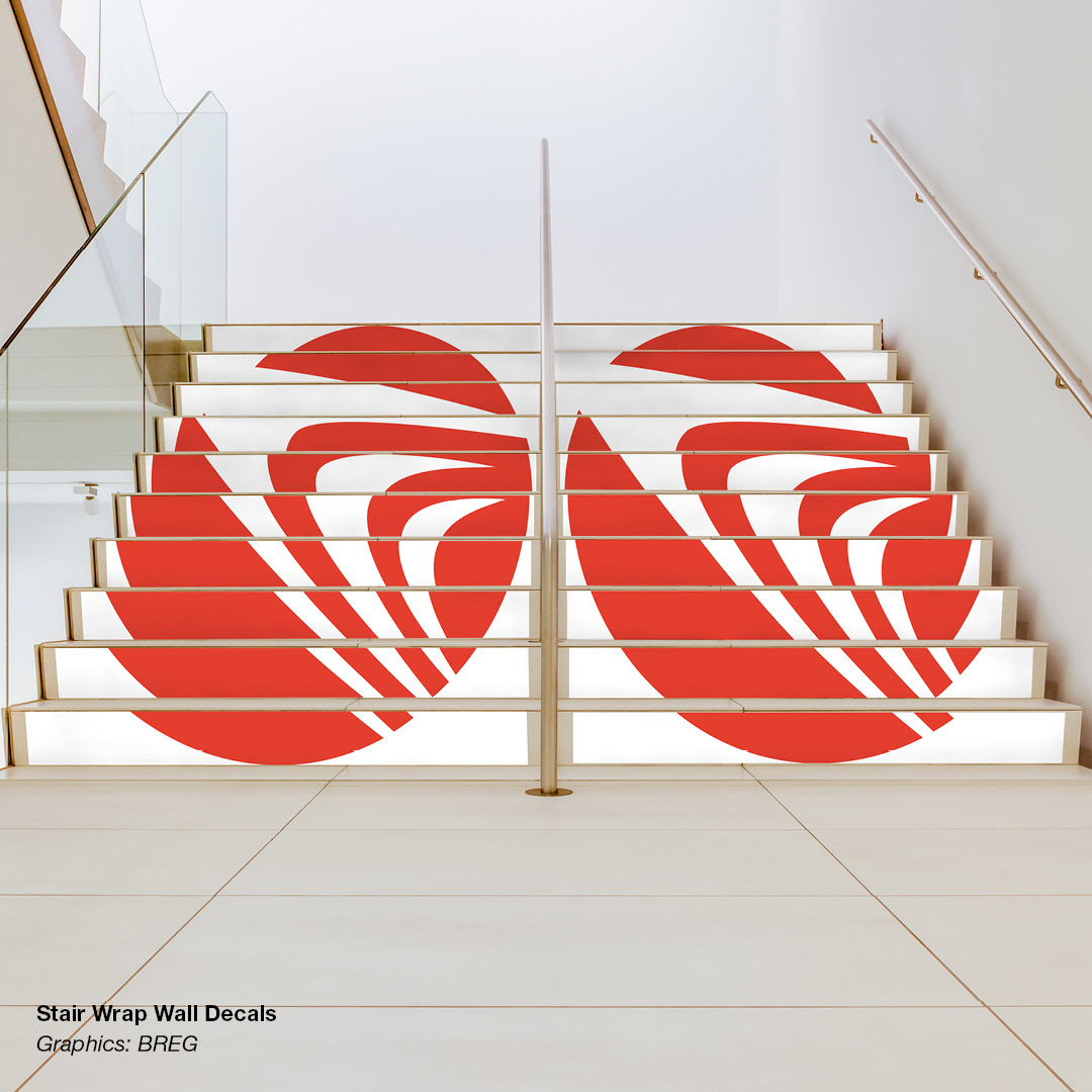
Step decals with graphics that connect to reveal a logo or message can show your guests that you are willing to go the extra mile to make an impact. Since staircases are often in high-traffic areas, they offer a huge blank canvas to set the tone of your event or provide important information to your attendees. You can welcome guests with a sprawling event logo, show your event’s core values through inspirational buzzwords, incorporate arrows to guide them to new areas, or even offer the space as part of a prime sponsorship.
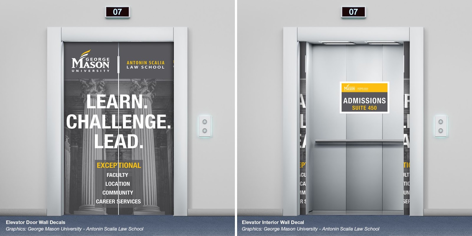
Wherever guests are in a situation where they are momentarily idle, there is a perfect opportunity for quick bursts of information through signage. This makes decals for elevator doors and interiors incredibly effective in visual communication and reinforcing your brand. Interior elevator decals can remind guests of upcoming activities or where to pick up gifts. Door graphics could list the activities found on different floors or display a clever phrase related to the event’s main theme.
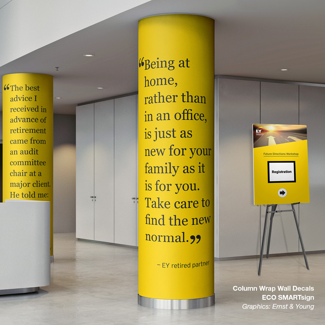
Column wrap decals offer a clever way to utilize the architecture of an event space to its full potential. They can recognize sponsors, highlight taglines or values, help with wayfinding, or simply add some excitement to a space.
While signage of this variety can add that wow factor to your event, it also requires more careful planning and knowledge of your event space. Designers would require exact measurements of the stairs, elevator doors, and wherever else a decal is needed to get the products to fit properly.
Let’s Get Designing!
Chances are you're using signs, banners, and other graphics at your event, and hopefully, this blog has shed some light on some key ways you can elevate them from just signage to big-impact branding. If you're looking for more ideas or graphic communication products contact us, we’d love to work with you on wowing your attendees at your next event!
.jpg)